Just a crop in of something to come.


Here is my submission for the DIA DE LOS MUERTOS show at Proximity Gallery. I wanted to focus on the religious aspect of the holiday and how it brings people closer to those who have passed on. I had alot of discussion back and forth with my room mate, Rachel about the piece so that it would read well and clear enough to get the idea across I was going for.

Another cool shirt illustration/design I did for The Wonder Years, a super cool Philly based Pop Punk band. Though the name of the shirt is similar to the tv show, its was actully going to be a song title for their split album with UK pop punk band All or Nothing. So instead of Its original song title it became "Don't open the Fridge!".
True story.

This summer, I took an independent study class at Harrisburg Area Community College with Professor Shawn Williams to further explore an area of interest I have. Book making/Binding.
I have learned a thing or two this summer about making books and printing for books like, its hard to hold detail in a screen printed image when its originally made for 8x11 and up and you print it in a 4"x4" area. None the less, even though the printing is not all that to be wowed by, the fact that I made my first printed book is an exciting experience. This is something that I plan on continuing and exploring so that I can then become a book maker.
Below is a close up to one of my favorite pages.
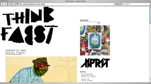
Think Faesthetic recently posted a nice link on their blog to my website as well as fellow peer Adrienne Langer.
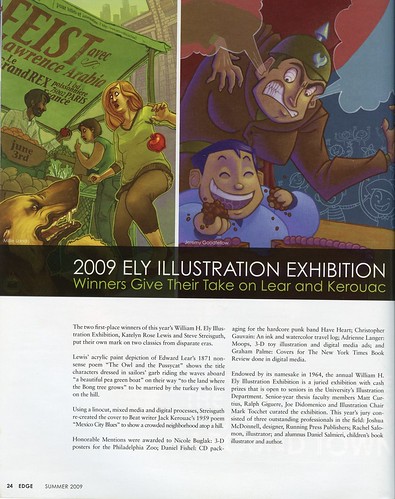
Also I was also posted in the University of the Arts EDGE magazine, about earning Honorable Mention in our Senior Thesis competition. Props to Kate Lewis for posting this originally on her blog.
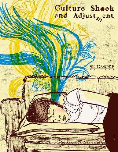
You can also view the packet as a PDF by clicking here to view it.
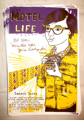
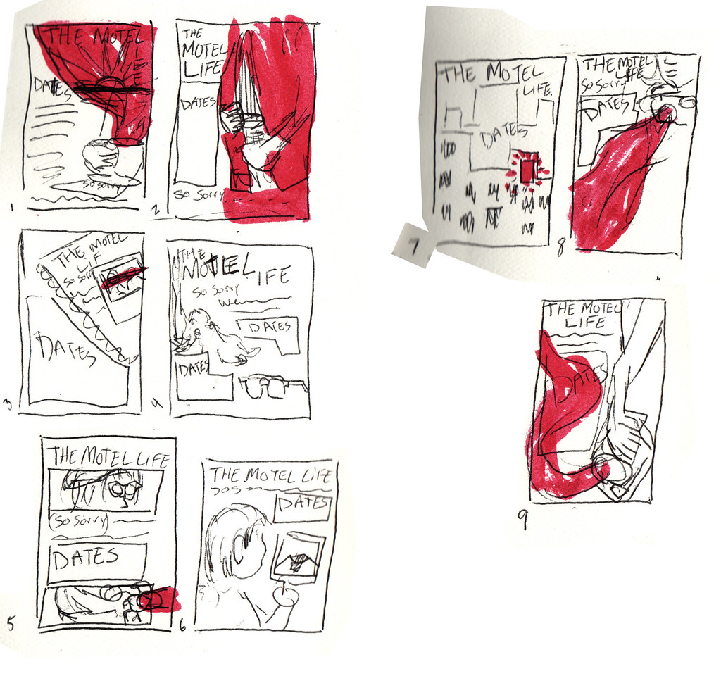
I just got done printing 100 of these bad boys, and sent them off to California, where the band The Motel Life (not to be confused with The Movie Life), will be playing a short 2 week tour. I do not have extra's so you gotta talk to the band if you want to get one of these posters for probably $5.
When the band contacted me back in July, they literally said, interpret the quote "(So Sorry) We're not what you're looking for" in your illustration. I took a week to think about it since the deadline was far enough away, and sent off sketchs. Got the final word a week later and did the finished image in a day.
The image they chose, was one that represents a 90's indie girl displeased with what she saw through her camera lens. Sketchs are below.