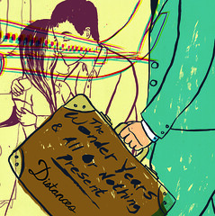
I sent them Sketches and they chose the one that fit the idea of traveling. So I drew a air port scene, but I didn't want to clutter it so I based the image around 3 different types of interaction. People leaving one another, people coming together and just leaving.

Full Spread of the 7 in sleeve
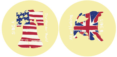
Because this record dealt with a band in the US and the UK, they wanted me to illustrate and design the labels on the records that represent something from Philly and something from Birmingham. So the liberty bell was an easy solution, but I was in the dark when it came to Birmingham. The band then said something about a bull that is famous that is in their town. They wanted the image to be graphic and have the flags in the labels. So I did just that.....

When designing the layout for the insert I was given full artistic freedom to do what I wanted. What I choose to do was make the layout of the lyric insert have a gritty taped photo copied letter feel to it. I wanted to set the type for clarity sake, but I needed a solution to how I could made the images feel alittle aged. The way I did it was with a printing process called Acetone transfer, which involves taking a acetone solvent from a blender pen to the back of a reversed photocopy and then using a bone folder to rub the type out and TADA! screwed up printed type that looks weathered and photocopied.
To see these images click here for the wonder years linear notes and click here for All or Nothing's linear notes.
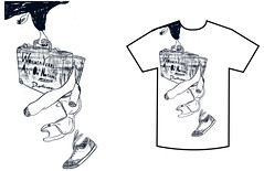
My Job doesn't stop just yet. After finishing up the record cover, I get an email from Chris at No Sleep Records saying that he also wants me to draw up a shirt design that would be printed one color to go along with the pre-orders. I say alright, lets do this! Again I got complete artistic freedom, so what I did was draw a bird carrying the same suitcase on the front cover popping open. The funny thing is, its a guy on the cover and there is a bra coming out. I know I broke a rule in art by weighing the bird down from not flying by putting it in the corner but sometimes you have to break some rules to gain a better image to what you want to focus.

enlarged image
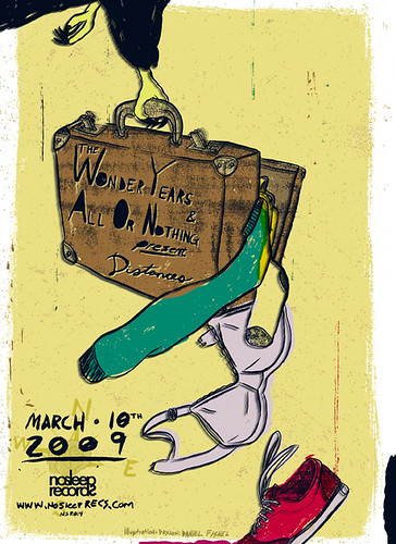
Once I finished this image I emailed Chris and was like dude this would make a awesome poster! So I finished up the poster and sent it to him in both a print and online version.

Above is the online version, here is the print version.
Last but not least, Chris created a animating banner to promote the album, but I created my own and he liked it a lot better so he is using it now.

For Some reason, this isn't fitting right
This project was really really really long, but it taught me a lot when it comes to working with a record label, an art director and a band all at once. It also taught me to work hard when I am under the gun of school and projects like these that come about.
I made this post with all the parts of the project to show and share the experience of the process and how one thing led to another.
Enjoy!


4 comments:
Just keep cranking, don't you
I never stop.
:)
Well I'm glad you find me funny, and not psychotic! and I'm really diggin that poster d00d.
Yeah man, great work!
Post a Comment