Showing posts with label The Wonder Years. Show all posts

Thursday, February 11, 2010

#9 on the Billboard Charts

I am proud to say that the record that I did handlettering for the cover, made it to #9 on the Alternative artist list.

Congrats to my boys! Support them on tour please.

Wednesday, November 11, 2009

The Upsides


"The Upsides" - Due out Jan. 26th 2010


I was asked by my good friends The Wonder Years to provide some hand lettering to go on to their new album, "The Upsides" coming out in late January.


When I talked to one of the guys 9 months ago while they were in pre-production, why they were choosing to use photography for this record whenever other records they put out had been beautifully illustrated; the answer was simple. They wanted to try something new, and had a lot of friends that did photography they wanted to try out. None the less I was glad to draw up some hand lettering to go on the cover of their new record. Below is the chosen piece you can click to enlarge in the first round of colors sent off to the band.


Tuesday, September 1, 2009

It's Never Sunny in South Philadelphia

Another cool shirt illustration/design I did for The Wonder Years, a super cool Philly based Pop Punk band. Though the name of the shirt is similar to the tv show, its was actully going to be a song title for their split album with UK pop punk band All or Nothing. So instead of Its original song title it became "Don't open the Fridge!".

True story.

Thursday, March 12, 2009

Distances Record Release Show!


Thanks for everyone who came to the Wonder Years Record Release show! It has been a run doing art work for the album, shirts, posters and even silk screening the poster the was posted for the event. It is both really awesome and flattering to see kids running around with shirts at the show with my art work on it.

I do have extra prints from the show, so if you would like to buy a poster, it will cost you $15 postage paid. Just shoot me an email at Daniel@o-fishel.com and I will give you my paypal email and in a week you will get your print.


This is The Wonder Years Merch Table with the record I illustrated and designed and also the record release silk screened sleeve! Its amongst shirts I didn't design but James Heimer totally did the record cover on the far left and the yellow shirt.

Saturday, February 28, 2009

Distances Record Release


4 color show poster: Silver, and 3 shades of blue with a 40 to 60 edition print


I have to say, it is hard to come up with a lot of concepts that deal with the idea of traveling and moving away to somewhere else. After a album cover, promo poster, and two shirt designs, I had to come up with a show poster that didn't have what all of those had...... suit cases, air planes and birds.

With this, I sketched out 5 different ideas before I came to a solid one, which typically doesn't happen often when I make show posters. This poster is a tip of the hat to one of my favorite comic book artist, Dan Clowes.

One thing I mentioned before about the Distances Record cover is that I wanted to capture, three moods. One in passing, one in embracing, and one in going alone. This poster is about being being lonely. I tried to show it the same way Clowes did. Empty streets, empty bench at a bus stop. I just drew it all at a overhead perspective so I wasn't ripping Clowes off totally and did it in my own way.


So Soupy of The Wonder Years contacted me told me this great idea for the record release show. He wanted me to design a envelope that looked like it went through the mail, being sent to the record release show. I was pretty stoked about the whole idea. Even so, when we talked about the return address, he wanted to use 123 Fake street, as a simpsons reference. So 38 of those were printed and 30 will be available to everyone at the record release show, first come first serve, and the other 8 go amongst the band, Chris at No Sleep Rec, and I.

See you at the show!

Friday, December 26, 2008

Going the Distance!

So a few months ago, I got a call from Soupy who plays in the Philadelphia based pop punk band calledThe Wonder Years! and he asked me to do a 7 in cover for their new split album with a UK based pop punk band called All Or Nothing. I was really stoked to take on the job, and put a lot of love into the art work.
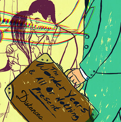
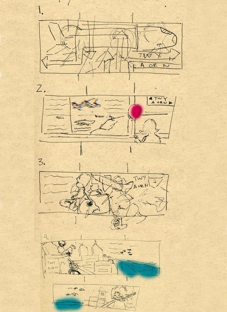
I sent them Sketches and they chose the one that fit the idea of traveling. So I drew a air port scene, but I didn't want to clutter it so I based the image around 3 different types of interaction. People leaving one another, people coming together and just leaving.


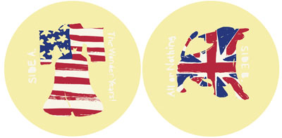
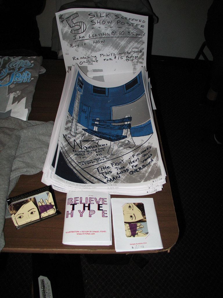
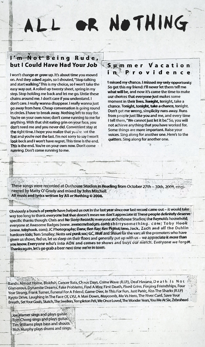
Full Spread of the 7 in sleeve

Because this record dealt with a band in the US and the UK, they wanted me to illustrate and design the labels on the records that represent something from Philly and something from Birmingham. So the liberty bell was an easy solution, but I was in the dark when it came to Birmingham. The band then said something about a bull that is famous that is in their town. They wanted the image to be graphic and have the flags in the labels. So I did just that.....


When designing the layout for the insert I was given full artistic freedom to do what I wanted. What I choose to do was make the layout of the lyric insert have a gritty taped photo copied letter feel to it. I wanted to set the type for clarity sake, but I needed a solution to how I could made the images feel alittle aged. The way I did it was with a printing process called Acetone transfer, which involves taking a acetone solvent from a blender pen to the back of a reversed photocopy and then using a bone folder to rub the type out and TADA! screwed up printed type that looks weathered and photocopied.

To see these images click here for the wonder years linear notes and click here for All or Nothing's linear notes.


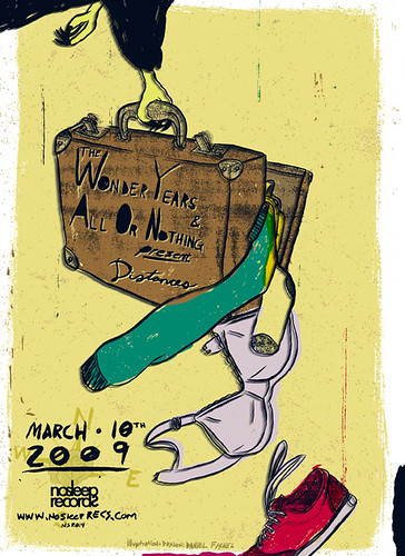
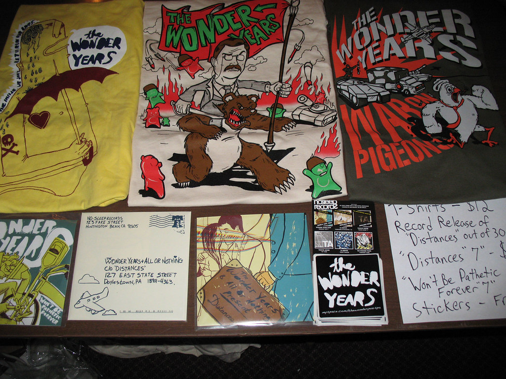
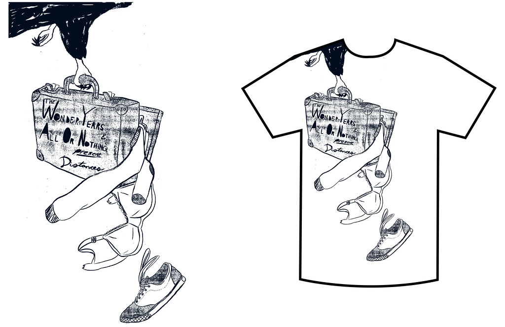
My Job doesn't stop just yet. After finishing up the record cover, I get an email from Chris at No Sleep Records saying that he also wants me to draw up a shirt design that would be printed one color to go along with the pre-orders. I say alright, lets do this! Again I got complete artistic freedom, so what I did was draw a bird carrying the same suitcase on the front cover popping open. The funny thing is, its a guy on the cover and there is a bra coming out. I know I broke a rule in art by weighing the bird down from not flying by putting it in the corner but sometimes you have to break some rules to gain a better image to what you want to focus.
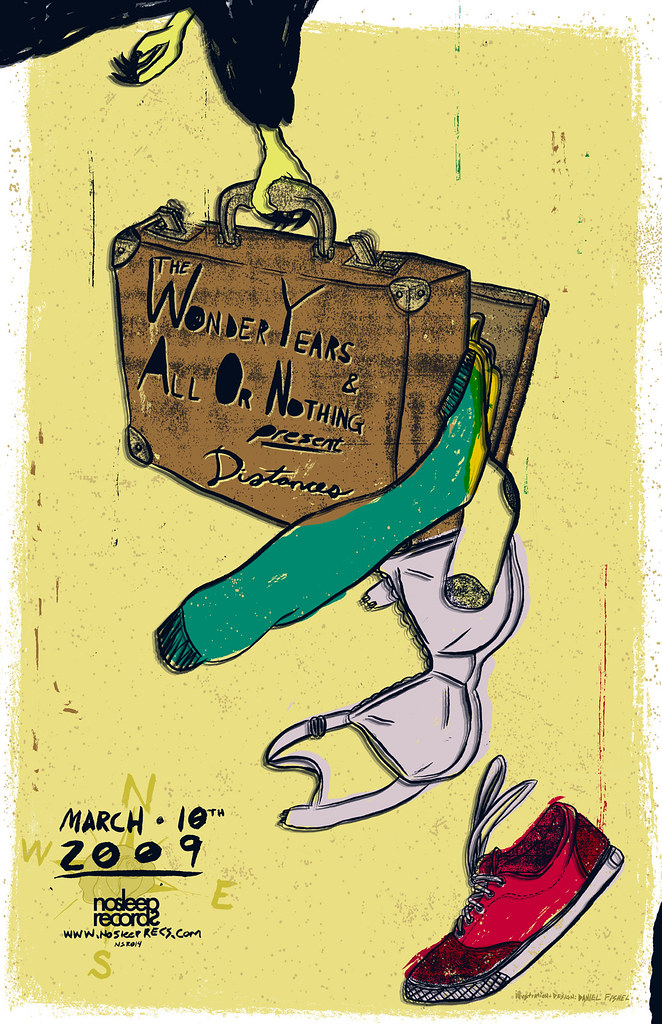


enlarged image

Once I finished this image I emailed Chris and was like dude this would make a awesome poster! So I finished up the poster and sent it to him in both a print and online version.


Above is the online version, here is the print version.

Last but not least, Chris created a animating banner to promote the album, but I created my own and he liked it a lot better so he is using it now.


For Some reason, this isn't fitting right


This project was really really really long, but it taught me a lot when it comes to working with a record label, an art director and a band all at once. It also taught me to work hard when I am under the gun of school and projects like these that come about.

I made this post with all the parts of the project to show and share the experience of the process and how one thing led to another.

Enjoy!

Sunday, December 14, 2008